Crushed! Weekly Market Review February 29, 2020
Stalling After The Bounce
MARKET COMMENTARY
Market indexes were crushed. Period. In equities, the $SPX was down 12% this week. Everyday was another selling day coming off the options expiration Friday. Whoosh. The carnage had the most scale in the high fliers club and the previously weak groups like energy. Some of the names were down 30% off the highs. Tesla was 38% off the parabolic high of a few weeks ago. My brother-in-law suggested hot dog water soup was in order for dinner!
Last week I posted a chart of the Nasdaq 100 being at ten year highs above the 200-day exponential moving average. Well, this week it was below the moving average on Friday and bounced to close just above it. That’s an amazing change.
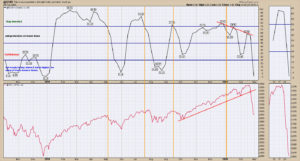
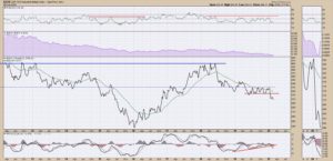
This week the Schnell Strength Indicator ah,er…ok, I think collapsed is the best way to say it. The SSIH is 2% which is uncomfortably numb. Nothing is trending higher. Do we have to go lower first? There will be a moonshot rally higher at some point. A moonshot rally is probable now, but not necessarily a new uptrend. The October to December 2018 period had a significant swinging range in the middle before the final breakdown.
We don’t get earnings until April, so let’s not hold our breath for some fantastic earnings numbers to revive us. I think what we are watching for now is a moderation of the virus growth rate in Asia, to recognize that it can be slowed. With the markets already hammering down into a significant market cap loss, is a 15% revenue slowdown priced in so we can build a base?
Nothing is trending higher. The breadth data suggests we are already at washout lows. Catch breadth data on Friday’s Market Buzz. The $SPX moved 50% of the range of the MONTH of January in February’s final hour of trading. Monthly profits can be made or lost in an hour. Friday’s bounce off the lows may be a swinging start.
Summary: It’s a good time to paint the house or swing trade using a 1-minute chart. Your call. You can also start to look for great growth companies that are not going to be as impacted and watch charts for entering when it suits you.
Let’s jump into the charts.
@SSIH – SELL SIGNAL
The Schnell Strength Index plummeted. Currently at 2%, it suggests a washout in momentum that you see after an extreme storm, like a tornado or hurricane as examples. The market will find a level. The SSIH is a strong tool to help keep profits. Right now, it would suggest waiting. An explanation of the SSIH was covered on the January monthly conference call. The link to the recording is here. January 2020 conference call.
________________________________________________________________________________________________
$WTIC – CRUDE OIL – –→FROM THE JANUARY 10TH REPORT
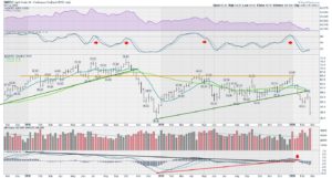
From January 10th report – Last week I mentioned there is an undertone of selling across the commodity related charts. That worries me for owning equities generally, as this recent run in stocks was based on a global improvement. Crude oil had a 10% wide range this week and closed close to the lows. The soaring volume hints at the wild week in the oil markets. The PPO wave is very low, so this is a concerning place for oil to break down. A roll over below the red trend line would suggest being defensive.
________________________________________________________________________________________________
$WTIC – THE UPDATE ON CRUDE OIL
The chart and commentary above is from January 10th where crude oil was near the highs at $65. This follow-on chart shows a 16% move down this week to the 2018 lows at $45. There is an intra-week low at $42.36, another 5% drop from here. Big volume too! What a wicked start to the year in the oil space! A 30% decline! Who needs tech for big moves? What I found interesting was the energy names were some of the top performers on Friday. Could this be a washout low here? Link.
________________________________________________________________________________________________
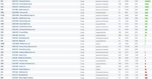
TOP ENERGY MOVERS ON FRIDAY FEBRUARY 28TH.
Below is a screenshot of how the $SPX US oil names behaved Friday. As crude closed close to the lows, I found it stunning how many names had a good Friday. More on the video! The Canadian names had a similar performance Friday. Investors were bottom fishing as these were down 30% intra-week. As the market cap declines, some companies may move out of the $SPX index.
________________________________________________________________________________________________
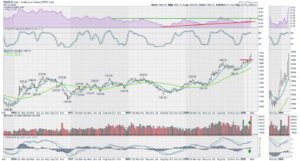
$GYX – GOLDMAN SACHS INDUSTRIAL METALS INDEX
I am a big believer in a chart breaking down when the momentum shown on the PPO rolls over and goes below zero. This PPO rolled over right after the signing of the Phase 1 trade deal. I mentioned it in the commentary that week that this had to start moving higher. The big message to any investor, is never ignore what commodities are telling us. Even if it becomes a false signal, it is better to be on alert. Link. Manufacturing is stalled and in trouble, worldwide.
_______________________________________________________________________________________________
$GOLD – MASSIVE REVERSAL
Gold ended last week surging higher but this week snapped in the alternate direction. Last week, I explained why Gold was difficult using the chart signals. On the surge, the gold optimists were strutting early in the week. By Friday, the optimists were shell-shocked. Twitter suggests the gold bugs still believe the $100 pullback was just a fake-out move for weak holders. With the highest volume ever, an outside reversal and potential divergence in momentum on the PPO, I am not convinced. Allow me to remind readers that Gold dropped about 35% in 2008. Also see the bearish outside reversal in Oct. 2016. Link.
_______________________________________________________________________________________________
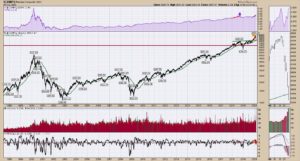
$COMPQ – SOARING VOLUME
There is hope this was the low here. The Nasdaq Composite was flying on Friday with washout level volumes. It was a billion shares higher than the washout low in December 2018. That is the second day that beat the washout low volumes of December 2018. Link. That’s extreme! The Nasdaq closed unchanged from Thursday, but it was a 325-point swing from the opening low to the high! It was, by far, the highest volume day EVER! Bottom line, investors migrated to tech names not defensives as shown on the purple panel.
________________________________________________________________________________________________
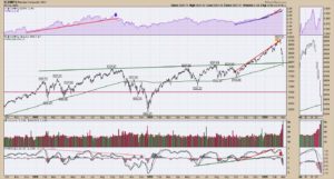
$COMPQ
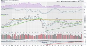
This chart is a zoom in on the last two years of the chart above. The green trend line and the 200-day both held on the closing price. For now, let’s mark it that support held. The parabolic outperformance of the Nasdaq composite compared to the $SPX shown on the purple panel continued. Usually investors move to the safety of defensives. This time, not so much!
________________________________________________________________________________________________
$INDU – THE DOW JONES INDUSTRIAL AVERAGE
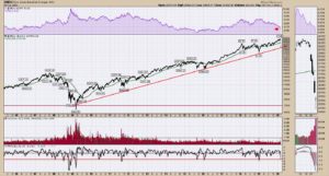
The Dow Jones Industrial 30 stock list is not the best gauge of volume. While the volume level was at 4-year highs, you can see it was nowhere near the highs of the financial crisis. What was odd this week was that the 30 stocks are normally the safe haven names, but in the purple area you can see they dramatically underperformed the $SPX and have for a year. Link. The PPO is at a level where it normally reverses from, while price lows reached the uptrend line. The Dow still closed down 357 as portfolios were shot down on the week. Friday’s rally was 750 points off the lows and created a hammer candle on the zoom panel. Bullish.
________________________________________________________________________________________________
$SPX
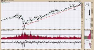
The $SPX hit 8-year volume level highs on Friday, also suggesting a bottom. One thing that concerns me on this chart is the break of the trend line. This is the important index. If we run a line off the furthest 2009 low with the December 2018 low, we have a little room left. I used a line with at least six touches rather than two. The hammer candle in the zoom panel is bullish short term! Link. We now need to run up 450 S&P points to get back to old highs.
________________________________________________________________________________________________
$NDX – NASDAQ 100
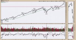
The Nasdaq 100 was not in extreme volume territory which I find incredibly odd. While it was one of the top three volume days in the last 4 years, it amazes me that this group wouldn’t be the overall volume leaders. Without going through a 1000 charts to find where all the volume was, the important thing is the Nasdaq 100 bounced exactly at the 200-day moving average and near the horizontal support resistance level. It did this on strong volume, so still supportive. Bullish!
_______________________________________________________________________________________________
INDEX COMMENTARY
While Friday may have felt ugly, the strong surge into the close can be caused by two things. 1) Short covering. They have to buy to close the short position. Probably went and bought Ferrari’s on Saturday with the winnings.
2) The likelihood the Fed comes out with some sort of an announcement to soften the downward momentum. It could just be verbal. Something like, ‘we are strongly considering moving sooner than later to maintain the strength of the US economy.’ That might be enough to stall some of the negative economic crash projections before their mid-March meeting. If we can agree that China will probably have 3-6 months of weakness but come out the other side, is that already priced in for our markets with a near 15% move down at the lows on Friday?
These volume extremes definitely give credibility to the lows being in on the initial dive down. I expect a dramatic bounce but that doesn’t mean I’ll be right. We set volume levels Friday. We could also set new volume levels and lower prices Monday. Caution.
One of the things about commodities is trying to buy near the lows. After dropping crude oil 30% in 2 months, assuming they can’t go to zero in 6 months(!), is there a possibility it could have a big bounce here? Absolutely. The buying in the energy names on the massive volume day suggests some of that as well. Be careful being short here. I would rather be long. If you look at some of the energy charts, after being thrown out of the airplane window months ago, perhaps they have found a mud base to try and build on.
Tech sold off calmly but significantly and could just as easily rip back up. I prefer buying when we get down to extremes on the breadth charts. That doesn’t mean it is comfortable, until the trade starts to work. It makes way more sense to me to buy on these massive extreme levels of volume, breadth, $VIX (yeah, who knew, it’s soaring!) and 30% off sales. The opposite was adding to high fliers on February 17th as the NASDAQ 100 was pushing through the top of the uptrend line, signaling euphoria. I will say the SaaS (software as a service) area seems near ‘dot com’ status in terms of future earnings multiples.
Two weeks ago, I politely responded with a different view to a tweet where the writer suggested investors had one foot out the door. I responded that I thought investors were all-in here (before the drop) and got blocked by the writer. Never disagree with someone who is bullish! Geez, I Am Canadian, I’m offended to be blocked! Anyway, that is what makes a market.
_______________________________________________________________________________________________
BONDS – BOOM BABY!
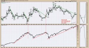
One of the key issues for bonds is the normalizing of the yield curve. If you need more information on this, I covered the yield curve on the video. My main perspective here is the spreading out in the yield curve happens as the equity market breaks. Some of the differential charts are a thread away from breaking out of important areas! Beware the bearer of news that this is a good thing in my opinion. If the distance between the 30-year yield and the 10-year yield increases, this chart goes up. Link.
________________________________________________________________________________________________
YIELD SPREAD CHART
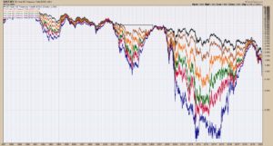
You can see the compression of yields, then the expansion on the yield chart as the yields start to separate after inverting. Guess the dates at the bottom. Link. One of the biggest movers this week was the five-year yield. It dropped 30% this week. Note the differences in yield moves this week. 30 year -12%, 10 year -23%, 5 year -30%, 2 year -35%. The chart above shows the 30/10 gap.
_____________________________________________________________________________________________
MARKET SUMMARY
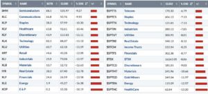
The US market is on the left and the Canadian market is on the right. Everything was as red as Margaret’s lipstick! Again, energy sold off hard and bounced Friday. Investors supported semiconductors the most but defensives were also near the top of the list. There are so many charts that are risky, including the banks may be breaking the 10-year trend line from 2010 to 2020.
_____________________________________________________________________________________________
GLOBAL VIEW
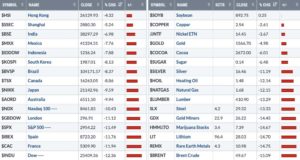
On the left, the world indexes were attacked by the red paint too. Commodities were crushed. Copper held up pretty good.
_____________________________________________________________________________________________
VIDEO OF THE WEEK
The monthly conference call for members will be held on zoom software Tuesday, March 3rd at 5 PM ET. Here is the link. March 2020 Conference Call Link.
Here is the link to this week’s chart list. Weekly Charts
Here is a link to this week’s Equities, Bonds and Currencies video Crushed!
Here is a link to the Commodities Review Video. Commodities Review!
Disclaimer:
Greg Schnell is an independent analyst and does not invest for clients. Greg Schnell does not collaborate to create a
positive/negative market bias, nor is he paid to promote any particular stock or perspective. These charts and descriptions are not
an instruction to buy or sell. You as a reader, are solely responsible for every investing decision you make. Greg Schnell and any of
his companies or relationships with other companies, are not responsible for trades. The ideas presented here are opinion. Trading
and investing involves risk to you and is solely yours.
Good trading,
Greg Schnell, CMT, MFTA.
_____________________________________________________________________________________________
BIOGRAPHY GREG SCHNELL, CMT, MFTA.
Greg Schnell, CMT, is the chief technical strategist at gregschnell.com specializing in intermarket and commodities analysis. Greg’s work has been regular reading on the world-leading StockCharts.com platform for thousands of investors. Hedge funds, RIA’s, portfolio managers, technicians and private investors consider the charts Greg displays. Greg Schnell is valued for his timely, in-depth, unique analysis that generates a valued perspective. Greg has won multiple awards as the Top Independent Analyst of the Year in Canada.
Based in Calgary, Canada, he is a past board member of the Canadian Society of Technical Analysts (CSTA) and past chairman of the CSTA Calgary chapter. As an active member of CMT Association, Greg speaks throughout North America on technical analysis. Greg is the co-author of Stock Charts for Dummies.


