Stalling After The Bounce Weekly Market Review February 22, 2020
Stalling After The Bounce
MARKET COMMENTARY
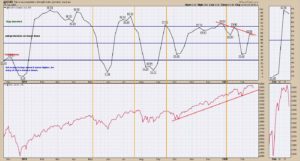
Market indexes closed lower as Microsoft and Apple pulled back. With the Nasdaq down 2% on Friday, it would appear that the technical correction is starting. This week the trend line on the Yen broke, following the Euro’s breakdown last week. With currencies changing, I watch for changes in the equity markets. Bonds also broke trend lines. The 30-year yield made a new low. The 10-year made a new weekly closing low. The 5-year and the 2-year have recently broken down below trend lines as well. With two asset classes breaking trends, looking for changes in the equities markets is more important. This week the Schnell Strength Indicator weakened again. The SSIH is still 61% which is marginally bullish but it is well off the highs of 75%. It is in the cautionary zone which suggests being careful / protecting with existing positions. The continuation of lower highs on the SSIH chart suggests a market running on fumes. The advance/decline trend lines did not break this week, but a weak day or two on the indexes would probably mark the breakdown. Crude oil rallied but oil stocks stalled. Copper was up a penny, but the copper miners underperformed copper. The big 5 miners all have weak charts. I dipped in on some nice commodity setups, but my stops knocked me back out on false breakouts. Gold was the stellar story, up $60 this week. After watching the gold miners underperform gold week after week, this week the GDX soared up 8%. This is the new area for momentum. Summary: Many signs of weakness out there. The coincident breakdown of currencies, bond yields, and a 2% drop in the Nasdaq 100, suggest more weakness. When everything seems to be changing, it probably is. I expect further erosion in the coming weeks. Let’s jump into the charts.
@SSIH – SELL SIGNAL
The Schnell Strength Index moved lower by 2%. Currently at 61%, it suggests caution. A break below 50 is a very weak market. Again, the purpose of the SSIH is to help us take profits before the market corrects hard, not after. Noting the lower highs since December and now only 61%, I continue to believe there is trouble ahead.
________________________________________________________________________________________________
$COMPQ – NASDAQ COMPOSITE
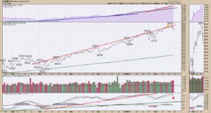
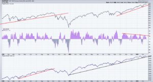
The purple area shows how the Nasdaq Composite has been accelerating in terms of outperformance compared to the $SPX. The slope has been increasing on each of the 4 colored trend lines. The relative strength in purple is still above the black trend line. If this market is going lower, I would expect it to break the black uptrend on the relative strength chart. With the big push down Friday, we have another PPO sell signal. Link.
________________________________________________________________________________________________
$NDX – NASDAQ 100
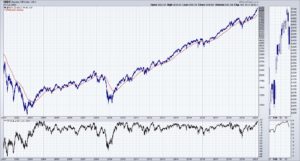
The PPO in the lower panel is using the (1,200) setting. This will compare the distance in percent from the price to the 200-day
exponential moving average over history. We have not had the Nasdaq 100 at this extreme in 17 years! I have trouble expecting
higher before we get some mean reversion. Link.
$DJW – DOW JONES WORLD INDEX
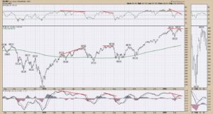
I don’t expect the $SPX to lead to the downside. Usually we see the rest of the world show weakness before the strongest market.
The world index has a double top structure with negative divergence on the RSI and on the PPO. With a PPO sell signal this week on
this daily chart, it also confirms a broad global weakness to match with the daily chart sell signal on the $SPX and $NDX. Link.
_______________________________________________________________________________________________
________________________________________________________________________________________________
$XJY – JAPANESE YEN
I profiled the US Dollar and the Euro break down last week, so this week I’ll show the breakdown through the 5-year trend line on
the Japanese Yen. Another major currency pair busting through the downside against the US Dollar. There is a very important
momentum trend on the PPO marked in red. Perhaps a stall in downward momentum there? Doubtful. Link.
_______________________________________________________________________________________________
$TYX – 30-YEAR BOND
The 30-year bond made a new low yield this week. The yield curve is moving lower across the various terms. It looks like it wants to
go lower. One of the conditions I am monitoring is the potential for us to make a higher low on the PPO momentum indicator now
that we have a lower low in price. A positive divergence would give us an important reversal signal in the coming months. Link.
_______________________________________________________________________________________________
$DJUSRR – RAILROADS
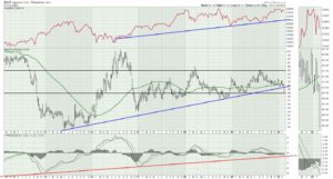
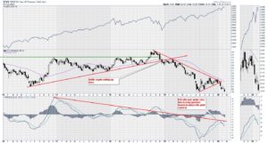
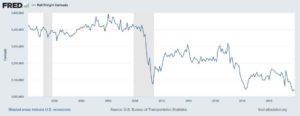
Railcar loadings appear ready to break to new lows. While the art of precision railroading has been a theme for railroad stocks, how much of a struggle is it going to be as global freight shipments are slowing? We have been in this carload downtrend for years. Is this the ammunition for expecting a resumption in industrial manufacturing? I don’t think so. The Baltic Dry Index has also been dropping since last August for bulk dry goods.
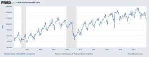
Another real concern is the rail intermodal traffic level at three year lows before the impact of lower international container freight starts to show in the data. These charts point to a gap between the rail stocks, the economic activity level, and the stock market in general. The indexes are pinned at the top of the chart while the data implodes underneath. That sounds like the backdrop for a whoosh lower if this Covid19 situation gets worse.
________________________________________________________________________________________________
$SUPADP – ADVANCE/DECLINE DATA
With the market getting pulled down on Friday, the uptrend on the advance/decline line appears at risk. The advance/decline line is
rising on the lower panel. A break of the line would be another signal of lost momentum (see 2018). Notice the A/D line has been
flattening since the middle of January or even since the start of the year. The middle panel shows an A/D 2-week moving average as
an area chart. Rallies getting smaller (fewer stocks so lower peaks) and shorter time duration (width of purple area) on each push.
The 2-week moving average closed negative again on Friday. Link. More info here on A/D.
________________________________________________________________________________________________
$XVG – THE AVERAGE STOCK MARKET
The average stock market (not weighted by size of the market capital in each stock) currently has a lower high. This is simply the
average where every stock has the same weighted value in the index. Without the weighting of Microsoft, Apple, Amazon, Google
and Facebook, the market is rolling over or at least setting up for weakness. The failed breakout and a potential lower high suggest
caution. The PPO momentum indicator is near the uptrend and has a sell signal by crossing below the signal line. Over the past few
weeks I have highlighted the extreme height of the PPO on the Nasdaq and $SPX. The PPO for the average stock market is nowhere
near the 2018 PPO level, whereas the Nasdaq 100 is at 10 year highs on the PPO momentum. With the lower high this week, this
chart now has a lower low and a lower high, which is the definition of the early start of a downtrend. Link. A caution flag.
________________________________________________________________________________________________
$GOLD
This week, the gold market soared $62. That’s a huge move and suggests the start of a new advance. If there was any doubt on Thursday, the acceleration Friday showed a huge move into the space. Up to last week, the charts had not improved and looked like a false dawn. The chart traded inside a 6-week range. This week, boom baby! $GOLD Link. The previous two weeks, the chart sported an outside bar, then an inside bar. Both signs of indecision. We got our decisive answer this week. We can add exposure.
________________________________________________________________________________________________
$GDX GOLD MINERS
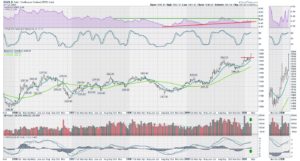
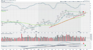
Gold miners moved back above the 10-week moving average this week. There were so many tentative signs for me. 4 of the last 6 weeks had higher volume on down weeks. As the chart formed a pennant, it was difficult to know which way it would break. The small range of the February 10-14 week was really a balance of buyers and sellers. The breakout is nice and a move through $31 goes to 5-year highs! Link. My preference is to own miners, not the bullion. Friday’s Market Buzz covered off gold names.
_______________________________________________________________________________________________
GDX:GLD RATIO
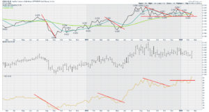
I like the gold miners / gold ratio. When it is trending higher, it is a good time to be in the gold stocks. I put the center panel with the ratio as a bar chart showing where it started and ended the week. Even this week, gold stocks started off underperforming the metal, then absolutely soared. Link. The lower panel shows the correlated price action of the gold miners after a trend line break.
________________________________________________________________________________________________
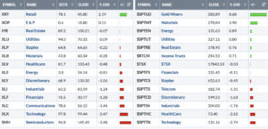
MARKET SUMMARY
The US market is on the left and the Canadian market is on the right. Defensives did well on both sides of the border, but still
declined. Retail was an odd winner, and Gold was the obvious winner. Semiconductors, usually the weekly leader, fell to last place
losing most of the gains from last week. I have no comfort that the defensives will stay strong if the Covid19 downdraft does show
up, but they might fall less. Biotech is one area that holds some interest. Trade in Gold, but be cautious. Volatility will pick up.
________________________________________________________________________________________________
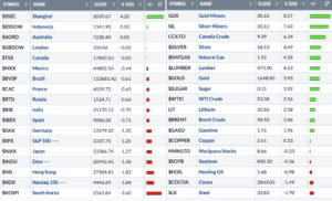
GLOBAL VIEW
On the left, the world indexes were negative as China propped up their market. In commodities, they broadly performed, but the
associated stocks did not, with the exception of gold miners.
VIDEO OF THE WEEK
Here is the link to this week’s chart list. Weekly Charts
Here is a link to this week’s video. Stalling After The Bounce.
Good trading,
Greg Schnell, CMT, MFTA.


